The other day I was reading Dundas’ whitepaper “Best Practices for Building Digital Dashboards” (PDF) [fusion_builder_container hundred_percent=”yes” overflow=”visible”][fusion_builder_row][fusion_builder_column type=”1_1″ background_position=”left top” background_color=”” border_size=”” border_color=”” border_style=”solid” spacing=”yes” background_image=”” background_repeat=”no-repeat” padding=”” margin_top=”0px” margin_bottom=”0px” class=”” id=”” animation_type=”” animation_speed=”0.3″ animation_direction=”left” hide_on_mobile=”no” center_content=”no” min_height=”none”][update: this whitepaper is no longer available] and you know what? What they say makes a lot of sense. I agree with at least 75% of what is written. For example:
… developers must be careful that the visuals do not interfere with the usability and efficiency of the digital dashboard…
or
Context is an item which in most dashboards is completely forgotten. This is baffling, as without context, KPIs are completely useless.
This really took me off guard. I was prepared for the worst and and what I get is this six-page whitepaper full of good advices that even Tufte would follow.
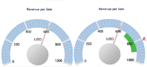 But wait… My skeptical mind wants to know if they practice what they preach. So, for example, what kind of context could we provide in a typical Dundas dashboard?
Here it is: add a little green stripe to a gauge, call it “context” et voilà: best practices at their best. Take a look at the report for similar insightful concepts “regarding usability and efficiency of the digital dashboard”.
Corollary: if you follow best practices and use common sense, you’ll be lost soon.[/fusion_builder_column][/fusion_builder_row][/fusion_builder_container]
Wow, a green stripe! Through such simple but effective use of color we can make a great visualization EVEN GREATER!
Yes, it was an epiphany for me too…
Web link to the Dundas whitepaper (HTML format, not PDF):
http://www.dundas.com/Dashboards/BestPractices.aspx
The suggestions in the body of the report are actually well grounded. The examples in the figures are horrendous.
I do agree that context is incredibly important in dashboard design. I just posted an article about it and my company’s dashboard, which I designed. If you get a chance, give it a read and let me know what you thing: http://www.gaffneyware.com/the_boxtone_dashboard_and_the_blackberry_outage.htm
Nice dashboard! I already left a comment on your site.